Village.Works
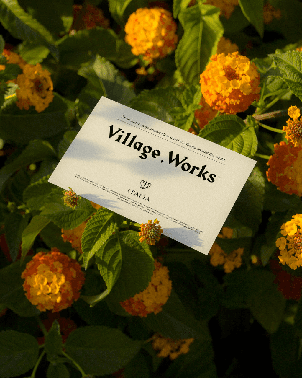
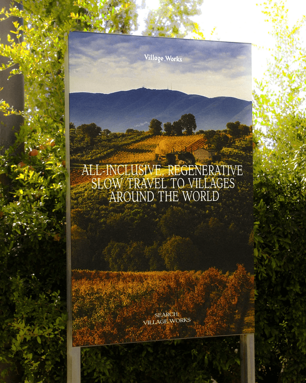
All-inclusive, regenerative slow travel to local villages around the globe.
“Blacksmith not only met but exceeded our expectations! The Village.Works brand now boasts a website that goes beyond being a mere platform; it stands as a genuine embodiment of our commitment to regenerative cultural experiences. The flawless integration of videos, images, and copy beautifully captures the essence of Italy’s hilltop villages.
Going above and beyond backend optimization, Blacksmith journeyed to us for thorough research, immersing themselves in the local culture to ensure every detail radiated authenticity. They weren’t just a hired team; by the end, they felt like family. A sincere thank you to Blacksmith for truly grasping, portraying, and elevating our brand beyond our wildest imagination.”
— Lexi & Mario, Co-Founders, Village.Works
Industry
Hospitality
Description
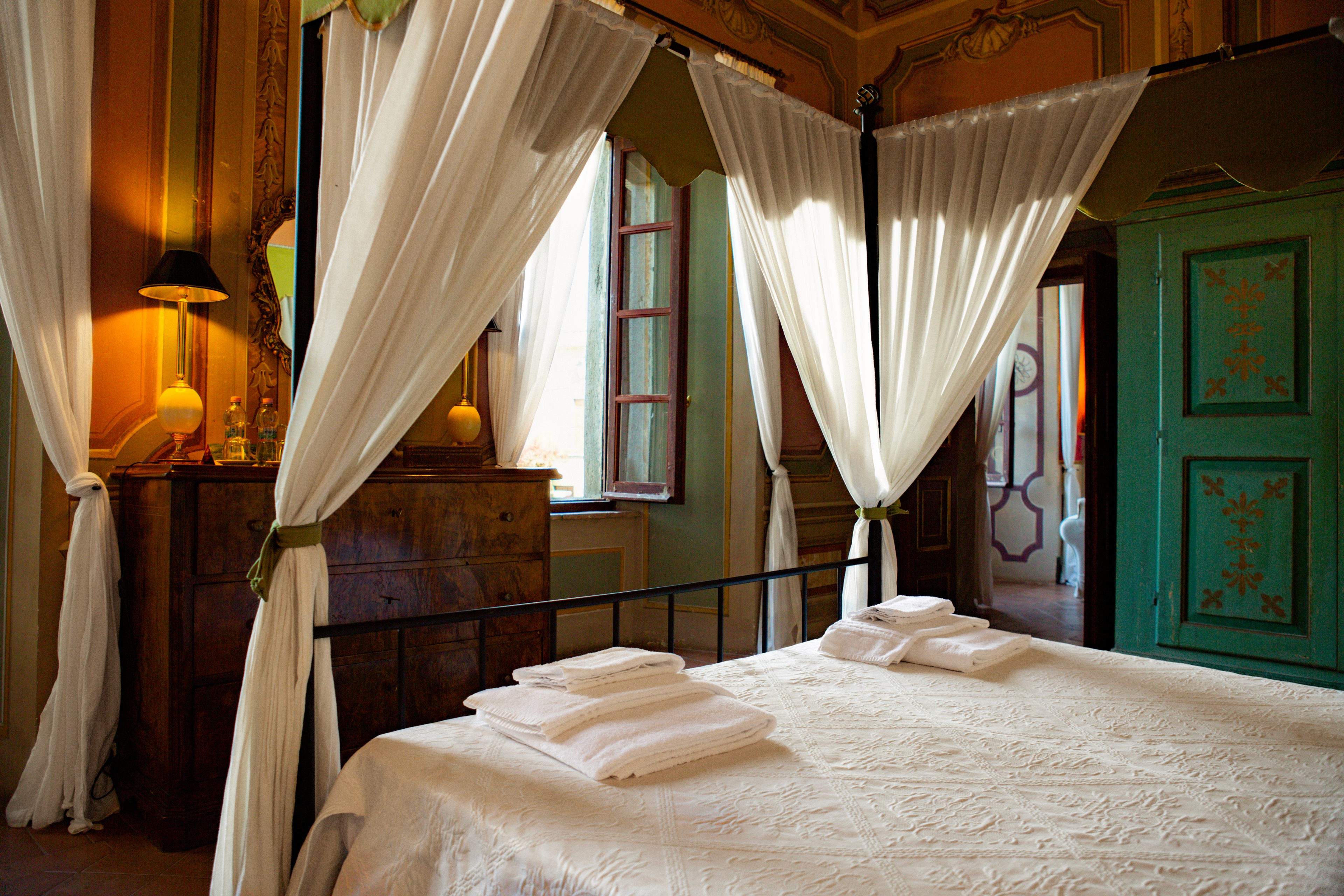
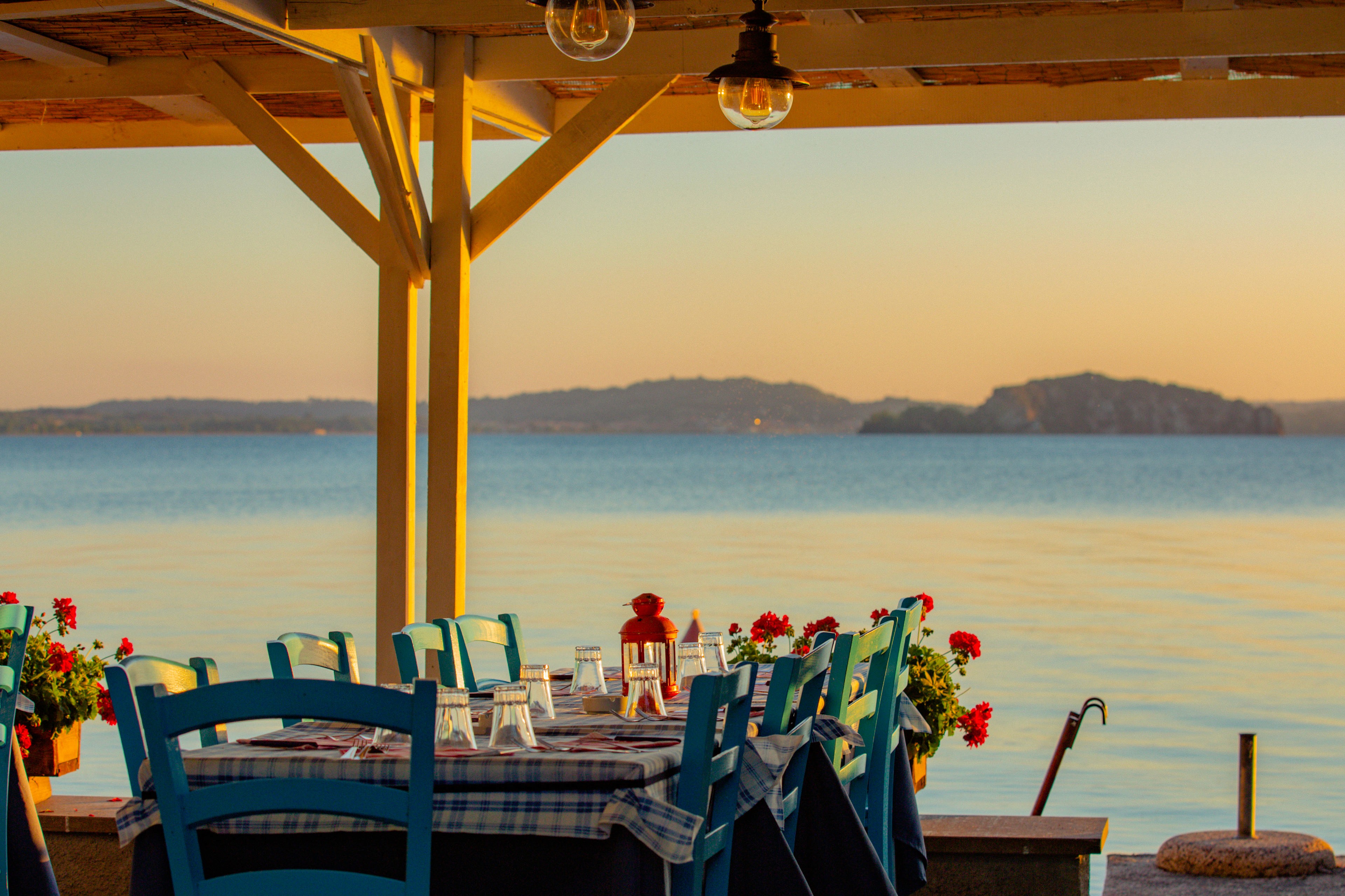
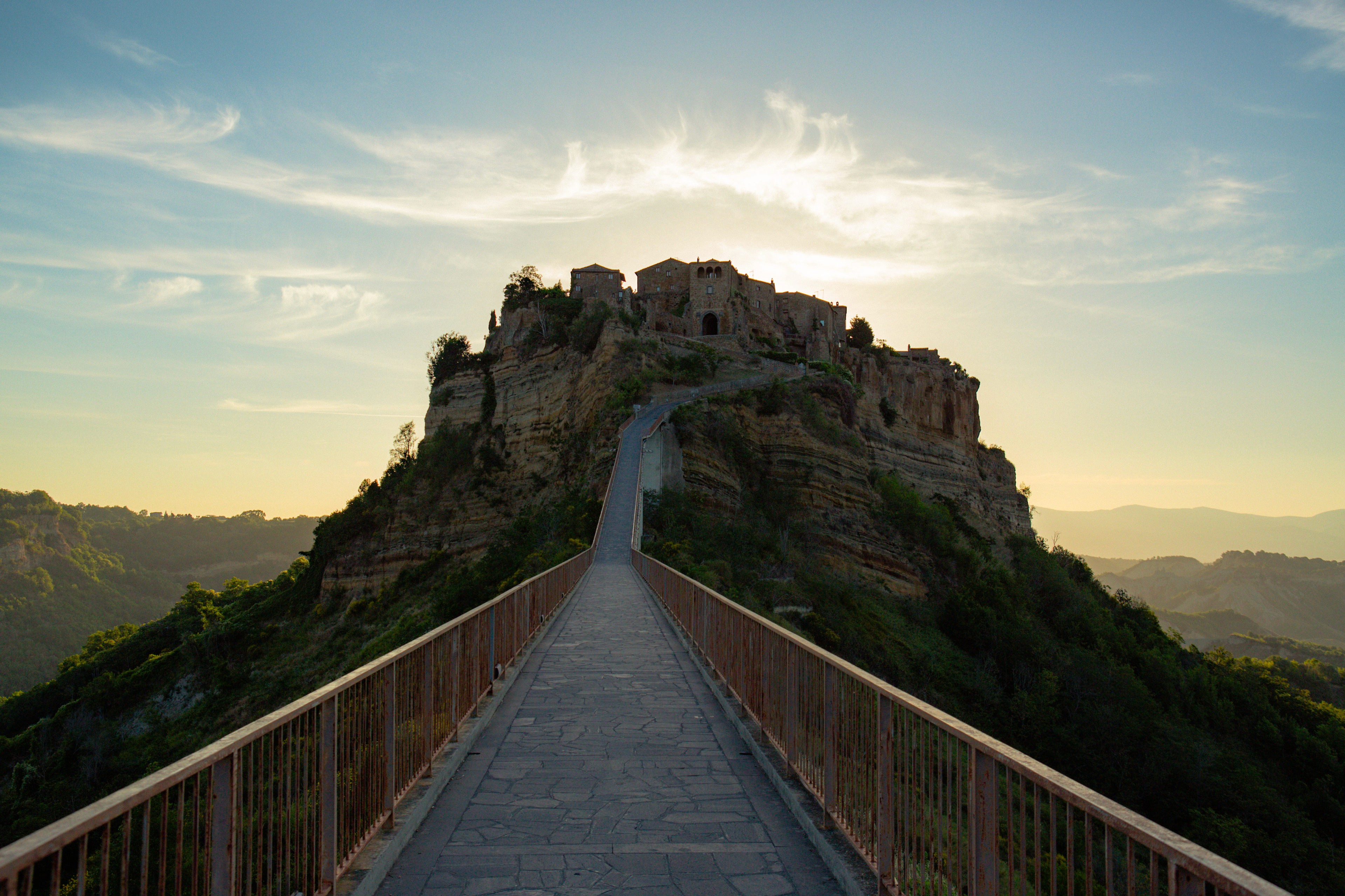
Village.Works is the anti-tour bus, helping hidden gems to quietly live on and prosper—preserving and protecting ancient cultural traditions and one-of-a-kind environments. They provide eco-conscious travelers a way to experience truly authentic culture through localized, all-inclusive slow travel designed to uplift not only guests, but locals, local culture, and Mother Nature, too.
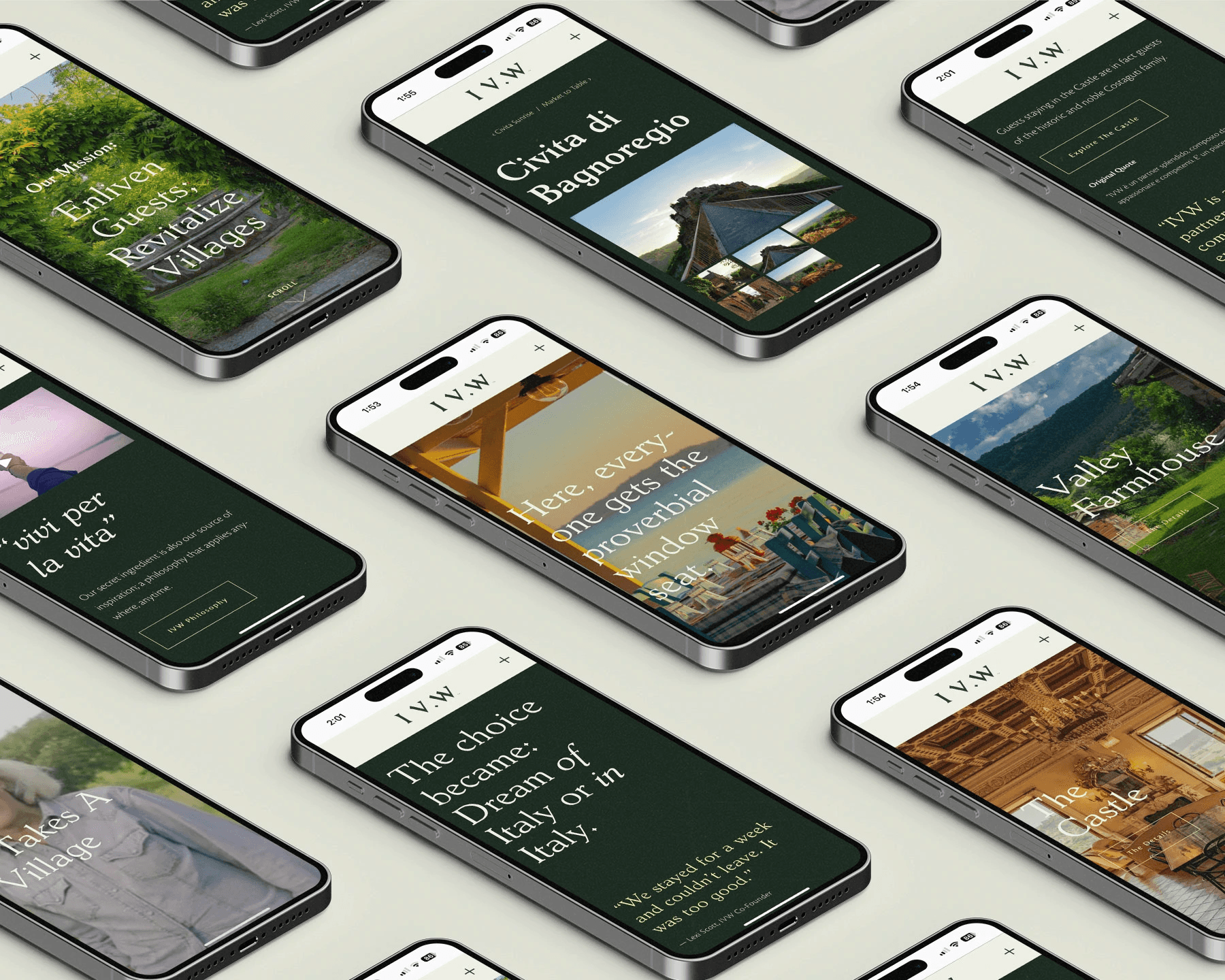
When we began, Village.Works was little more than an idea. The Italian team took on mobilizing the village and their services while we focused on building their brand messaging, positioning and identity; capturing & creating content in Italy; building their back-end systems; and creating marketing tools such as the website, video, social media and copy.
Our challenge was to capture and communicate the wild, rustic magic of Tuscia and its people while keeping in mind that Village.Works wanted to expand to other territories after proving the model in Italy.
Services
Art Direction Back-end Systems Brand Identity Design Creative Direction Messaging & Copy Photography & Imaging Video Production Web Design & Development
~
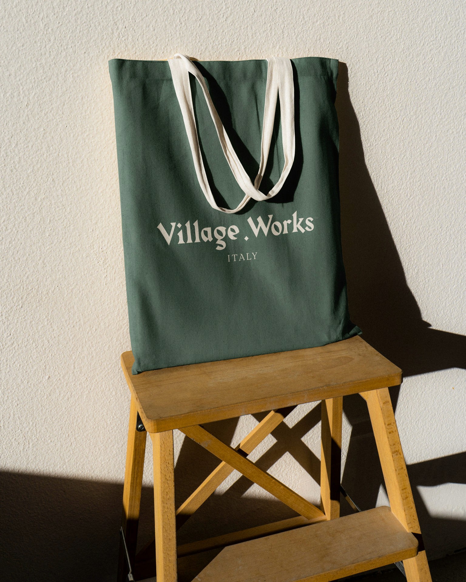
Logo Mark
The logo mark arranges the letters “V.W” in such a way that allows the negative space to resemble the rooftops of a village with the “.” doubling as a window.
~
Word Mark
The word mark style emulates medieval calligraphy techniques using modern type proportions to create a balance between the historic nature of the villages with an approachable and natural sensibility.
~
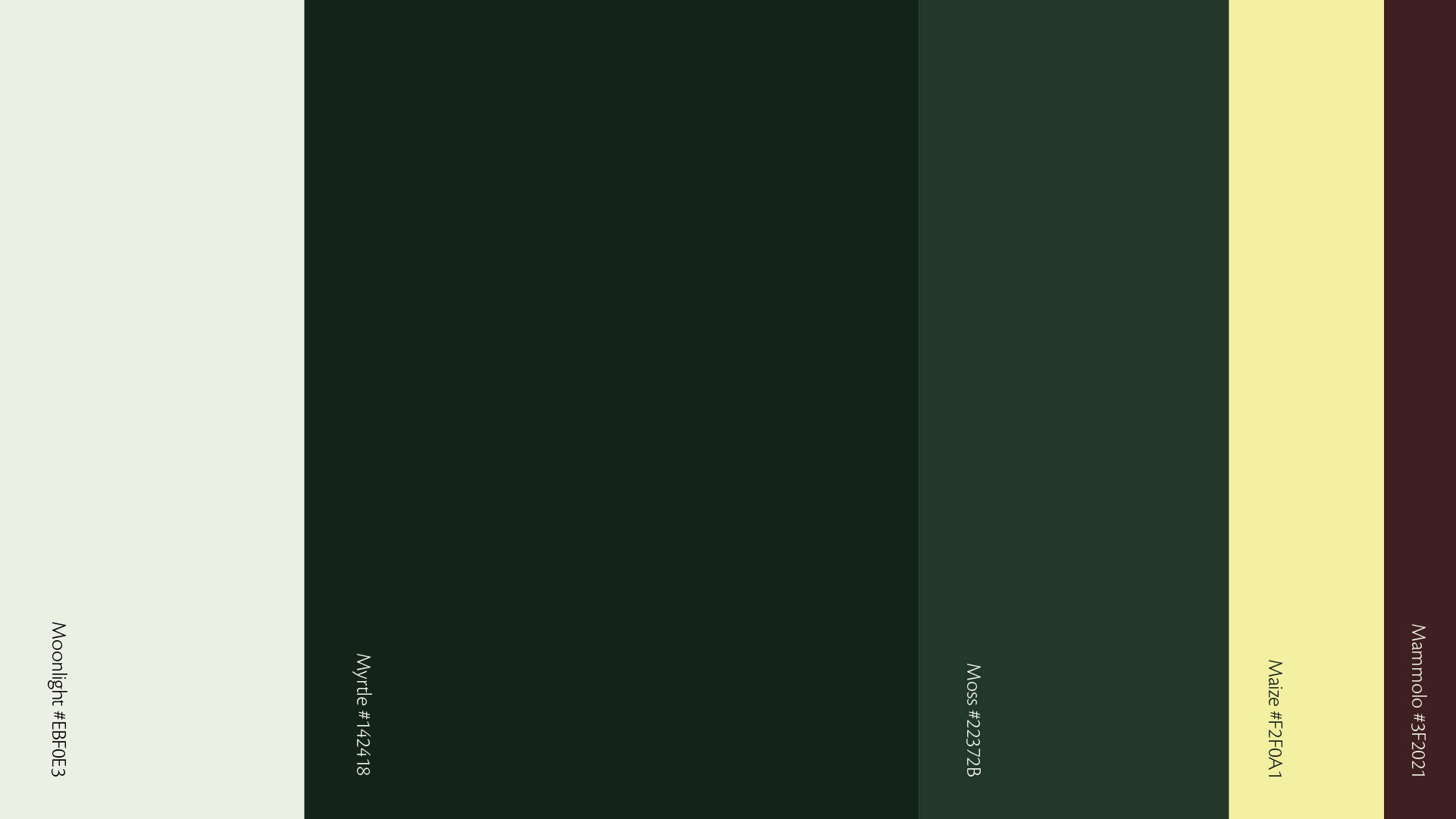
Color
Derived from the elements found in and around the villages, we chose earthy green tones mixed with a soft greenish-white and a bright maize color for the accent.
~
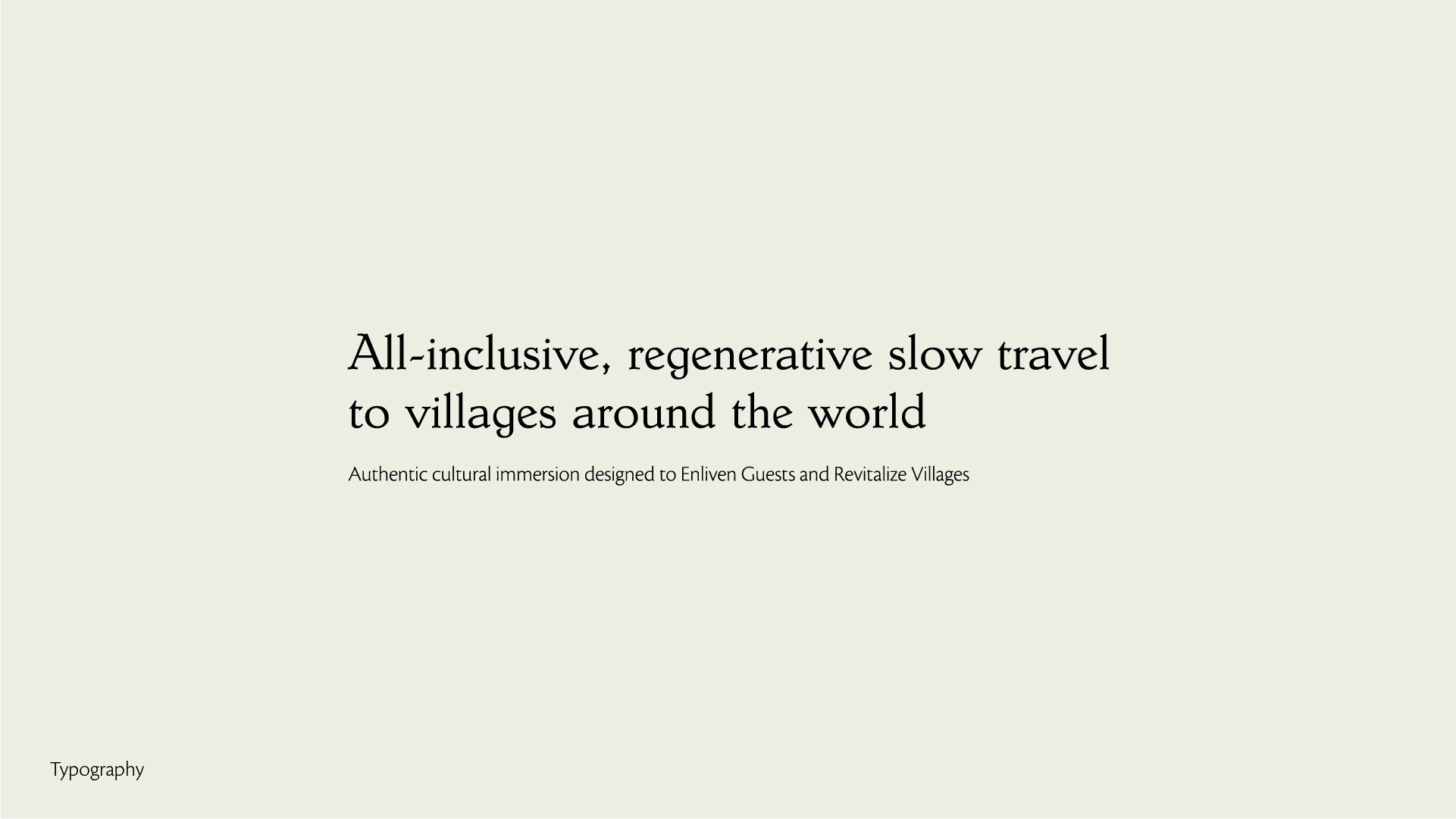
Typography
The fanciful typography selected for this project was chosen for it’s natural and whimsical letterforms that create a legible balance between medieval and modern type.