London DAO
London DAO is a Decentralized Autonomous Organization operating in the web3 space as a champion of ETH culture and history.
“[Blacksmith] went above and beyond to create something that truly reflects London DAO
and we could not have been more pleased with the results.”
— London DAO Council
Industry
Tech
Description
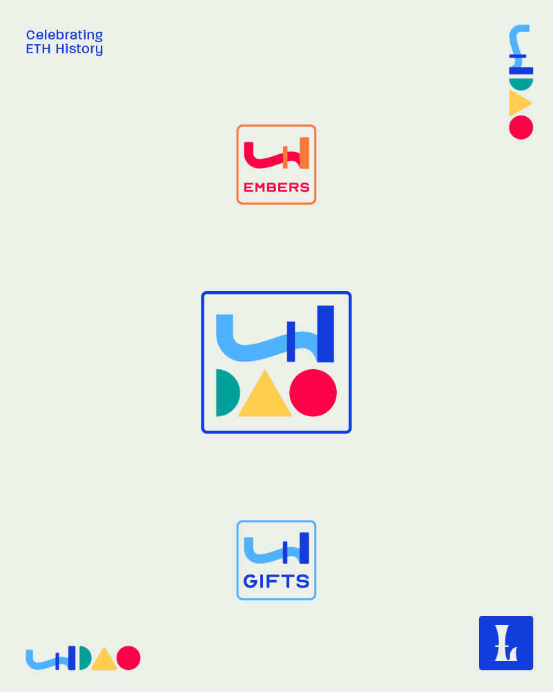
London DAO is a leader in the generative art NFT space, a community of de-fi and gen-art lovers coming together to manage a treasury born from NFT sales of London GIFTS, London EMBERS, and $LONDON token. The NFTs and London DAO grew out of Proof of Beauty Studio.
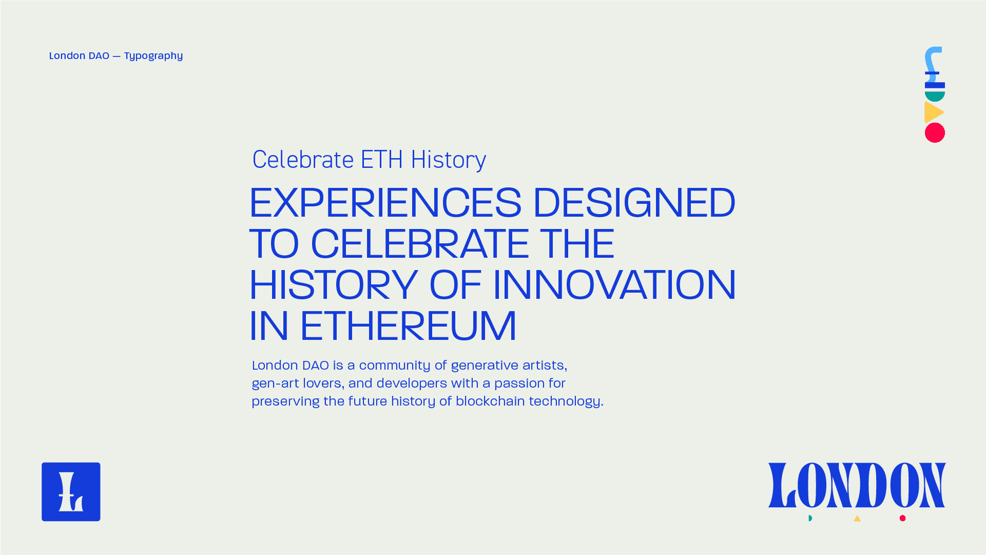
When the London DAO council came to us, they had an existing brand identity, but felt that it could be updated to reflect the project's unique personality. Together, we developed their brand's message and positioning in the NFT / web3 space to help crypto users better understand ETH history.
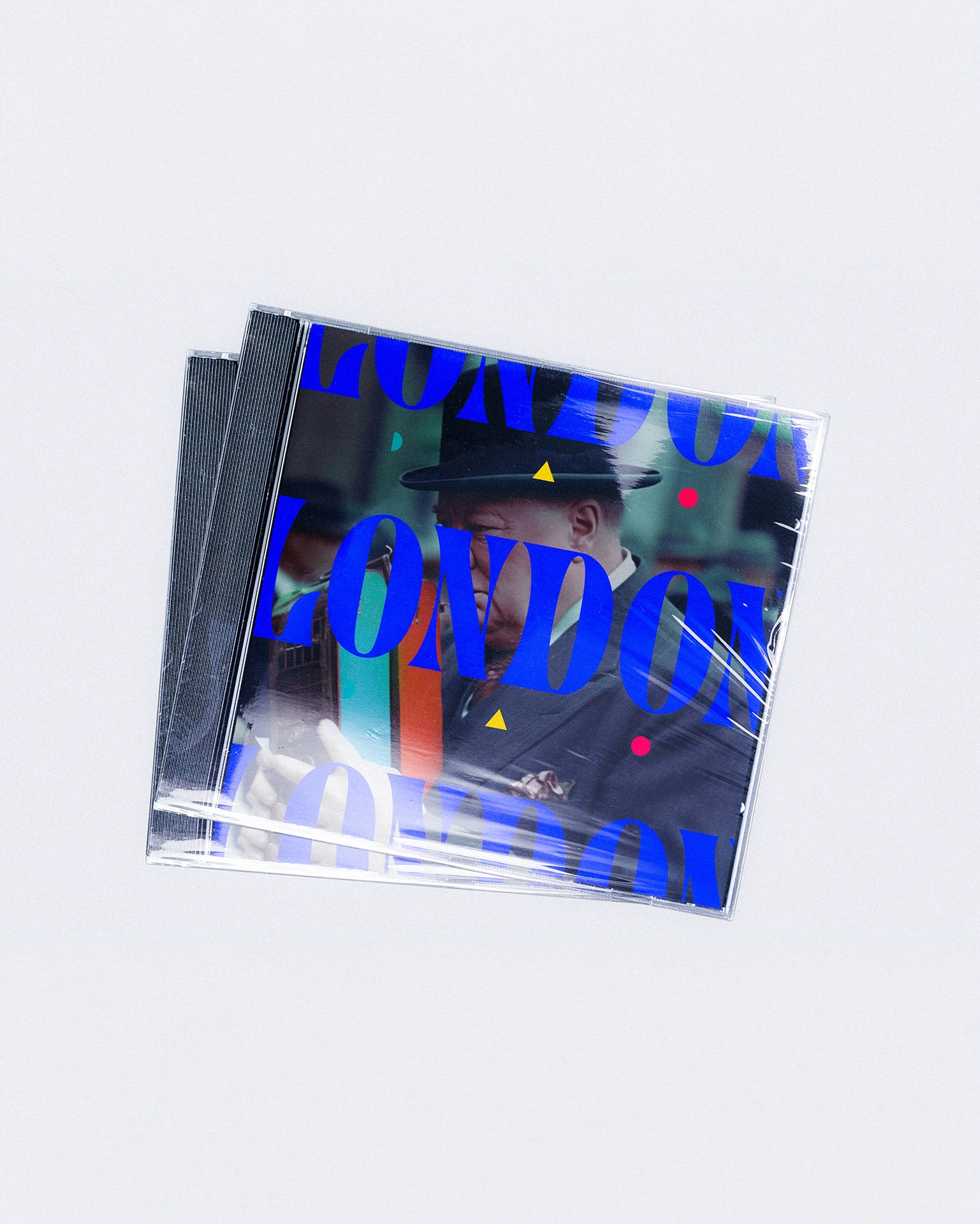
The attitude was to reflect the aesthetic history of the city of London while maintaining the colorful, geometric shapes featured in the NFTs. Working off a brand anchor of “Structured and Chromatic”, we took our direction from 1960s London counterculture and primary colors as geometric “building blocks”. We worked closely with the DAO council to hone in on a style that represented their celebratory yet sophisticated nature.
Services
Brand Development Brand Identity Design Creative Direction Icon Design Merch Design
~
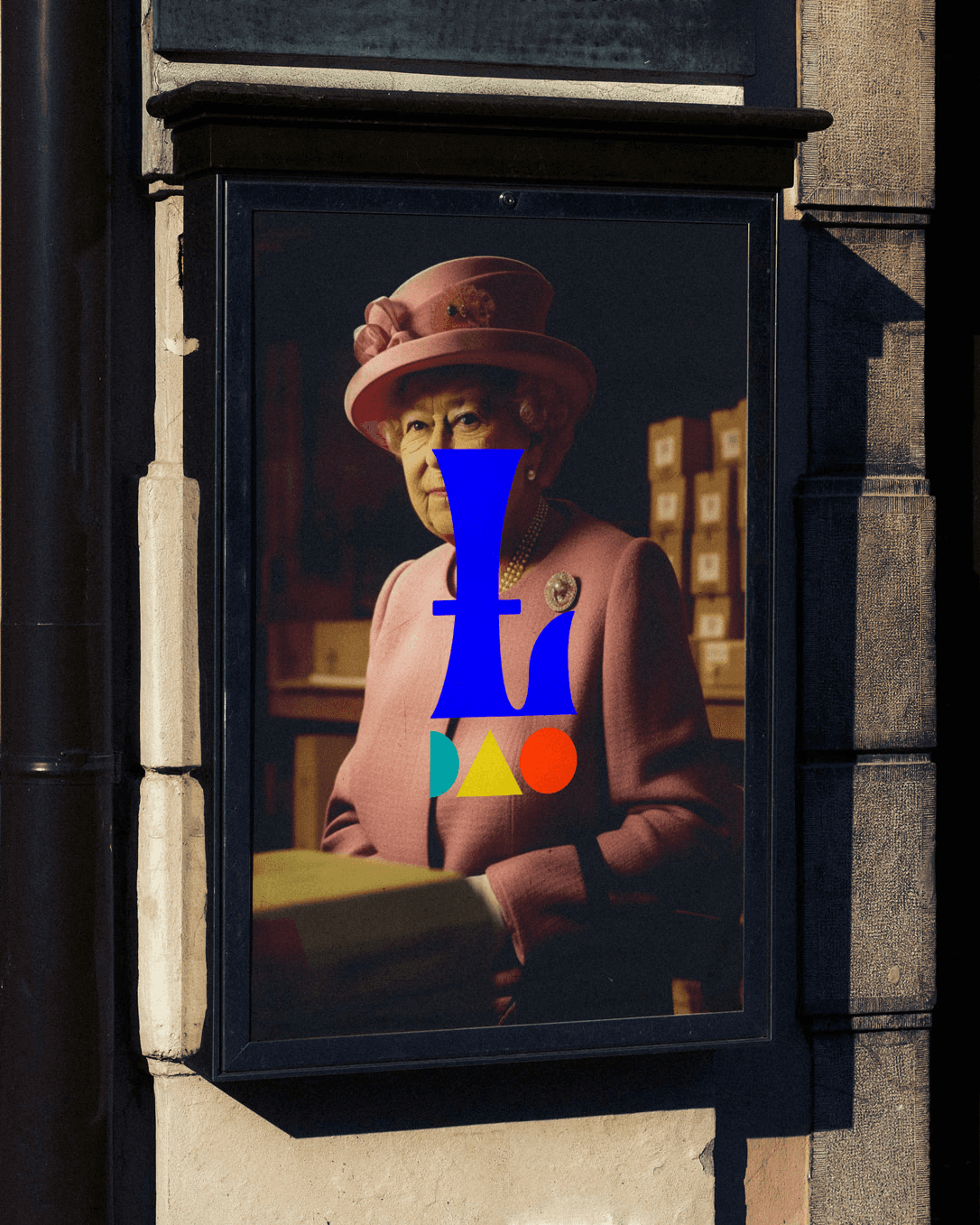
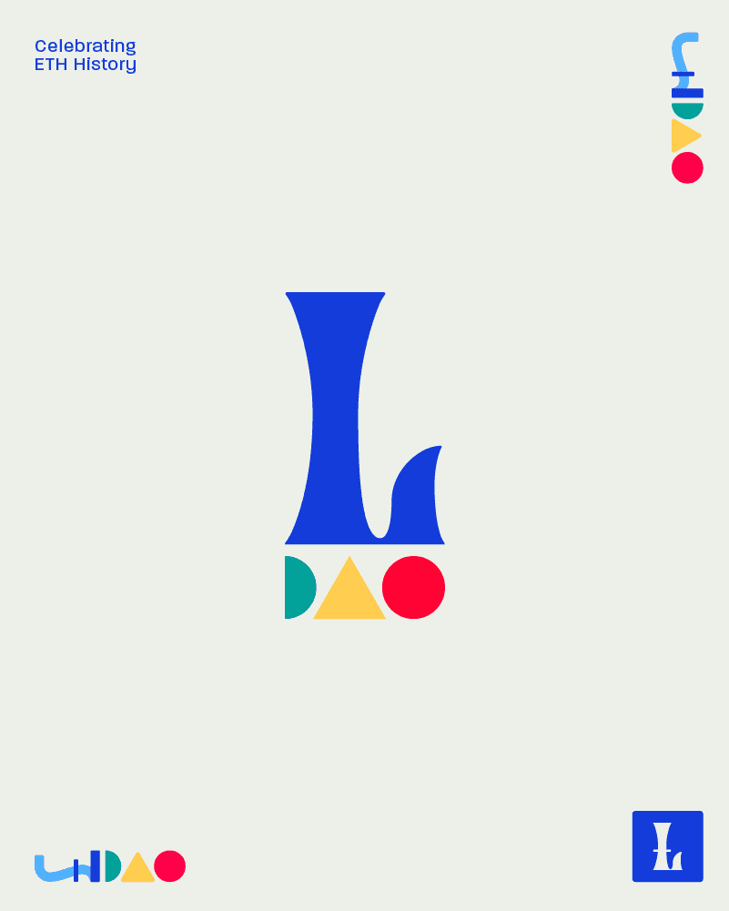
Logo Mark
The pound symbol (£) for British currency was an essential form to communicate, both as a symbol of currency and as a metaphorical representation of the Ethereum Layer 2 Hard Fork London DAO was built to celebrate.
~
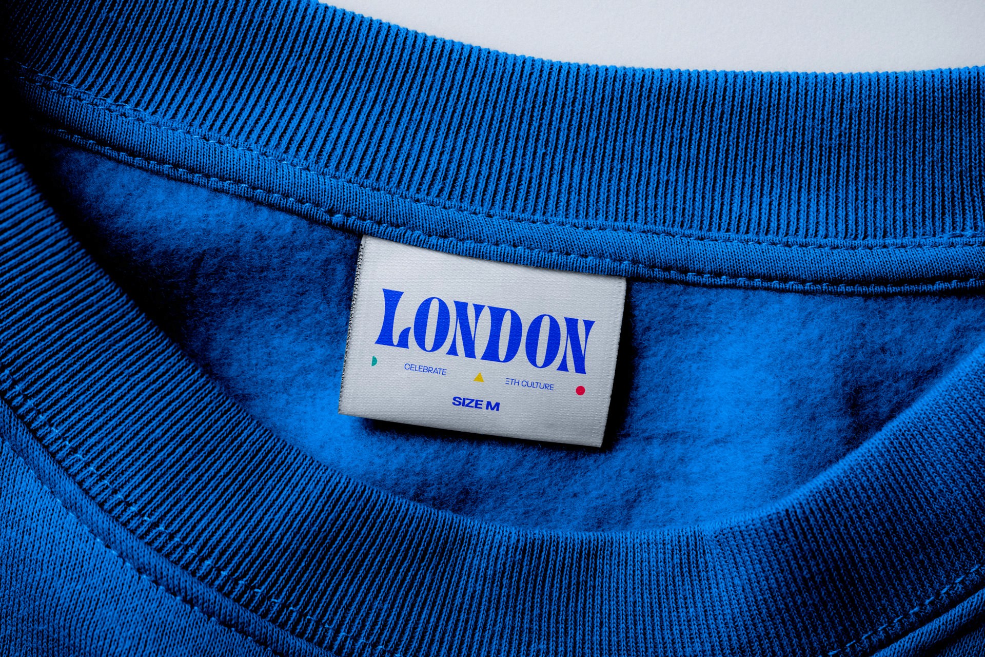
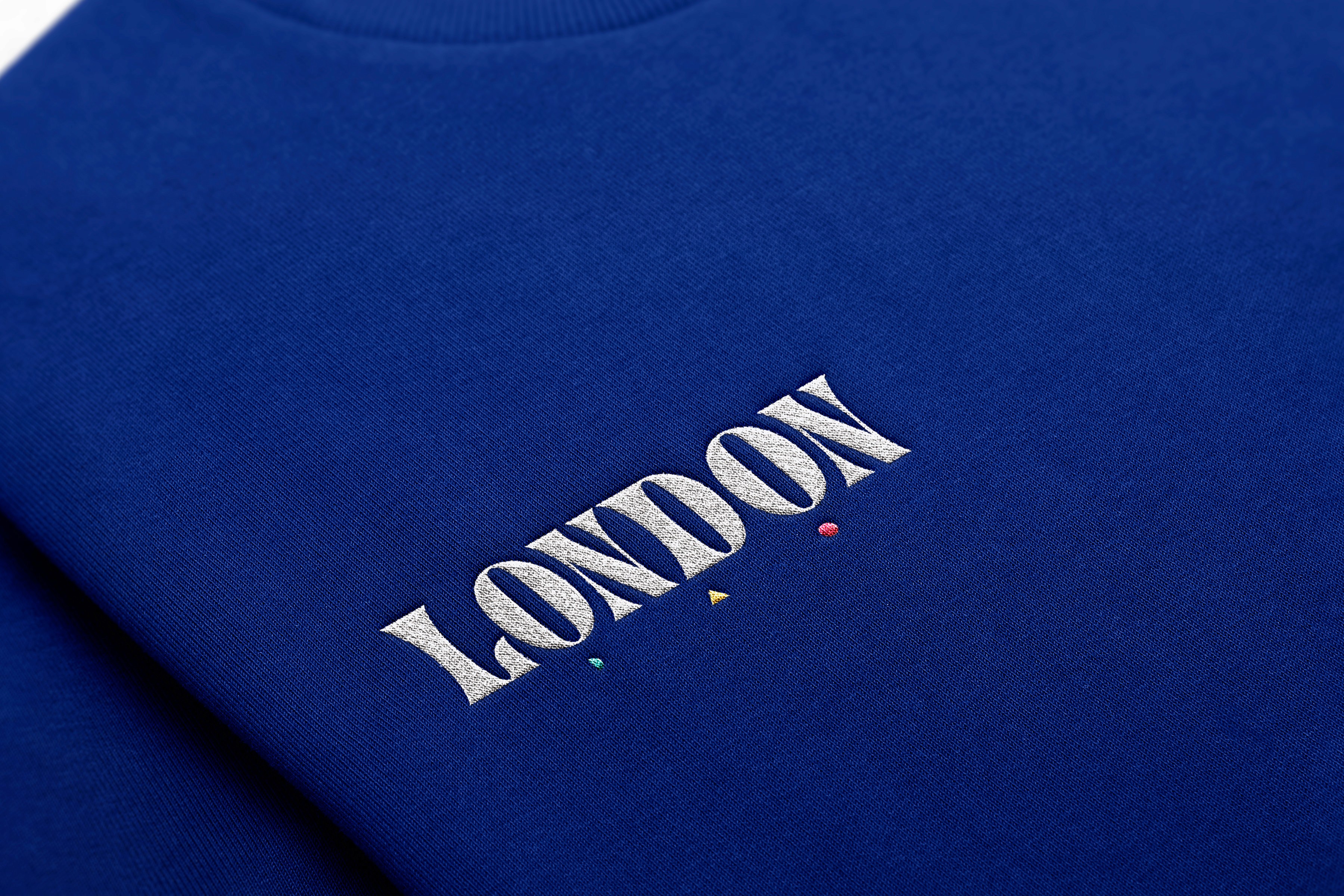
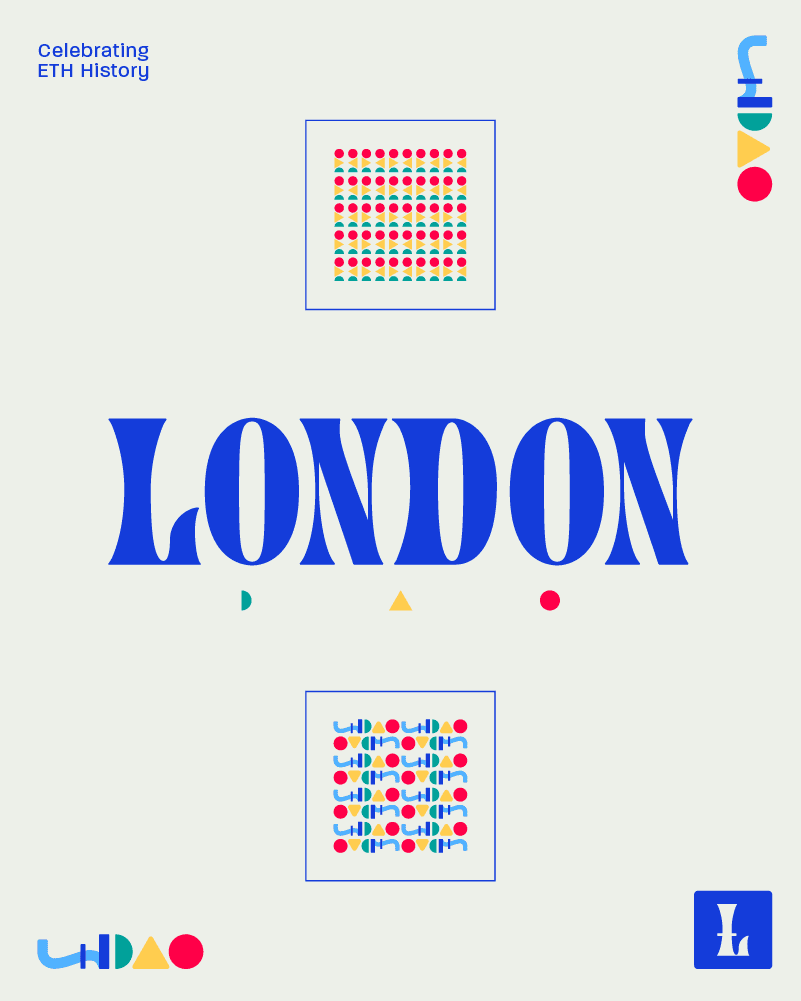
Word Mark
The word mark features elongated, striking letters with exaggerated curves and varying thicknesses, which evoke the playful and experimental design trends of the 1960s. A subtle, geometric “DAO” sits beneath as functional ornamentation.
~
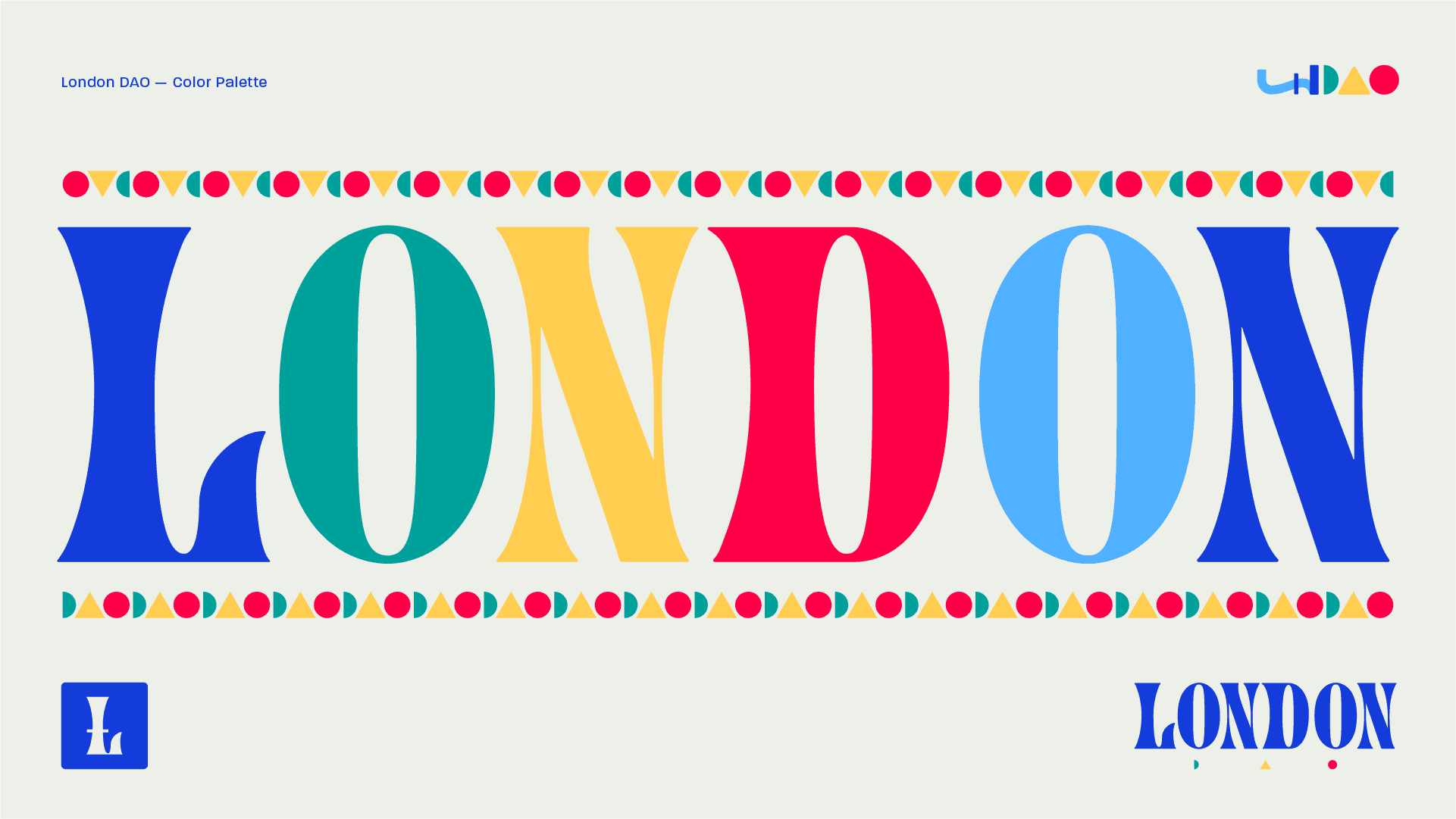
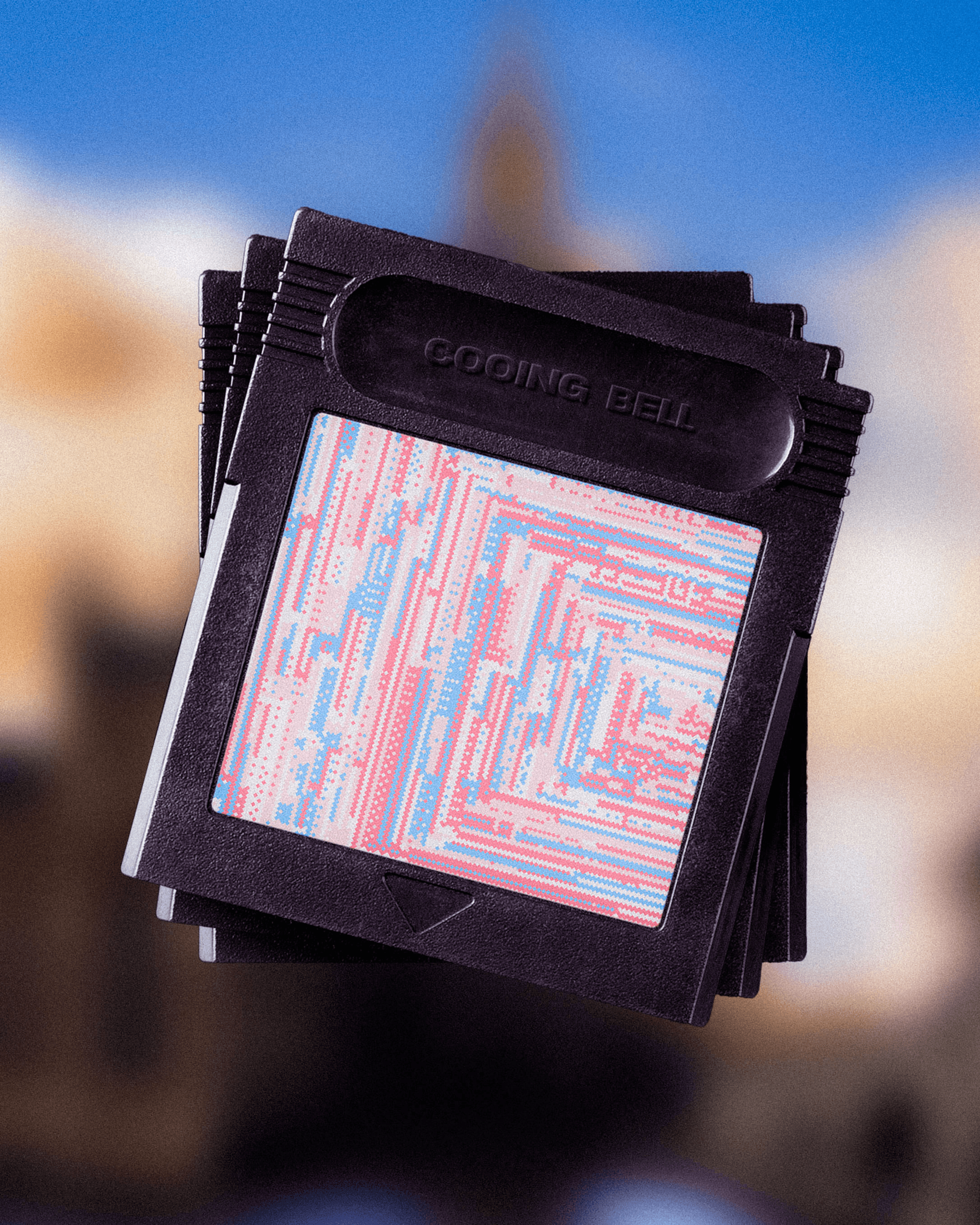
Color
The color palette is designed to evoke a sense of vibrancy and playfulness, reflecting the dynamic energy of 1960s British design. We aimed for a balanced mix of bold, warm, and cool tones that play together harmoniously.
~
Typography
Strong, impactful headings are combined with clean, legible body text, creating a professional and modern aesthetic. This balanced approach ensures key information stands out while reflecting the innovative spirit of the organization.