Groups
Groups provides affordable, outpatient opiate addiction recovery with Suboxone and group therapy.
“When Blacksmith began, we had 2 offices; now there are over 100 in 17 states. We’re seeing about 10,000 patients per week and have engaged hundreds of thousands of patient encounters.
Blacksmith’s work has hugely influenced and strengthened our brand’s performance.”
— Jeff De Flavio, CEO, Groups
Industry
Medical
Description
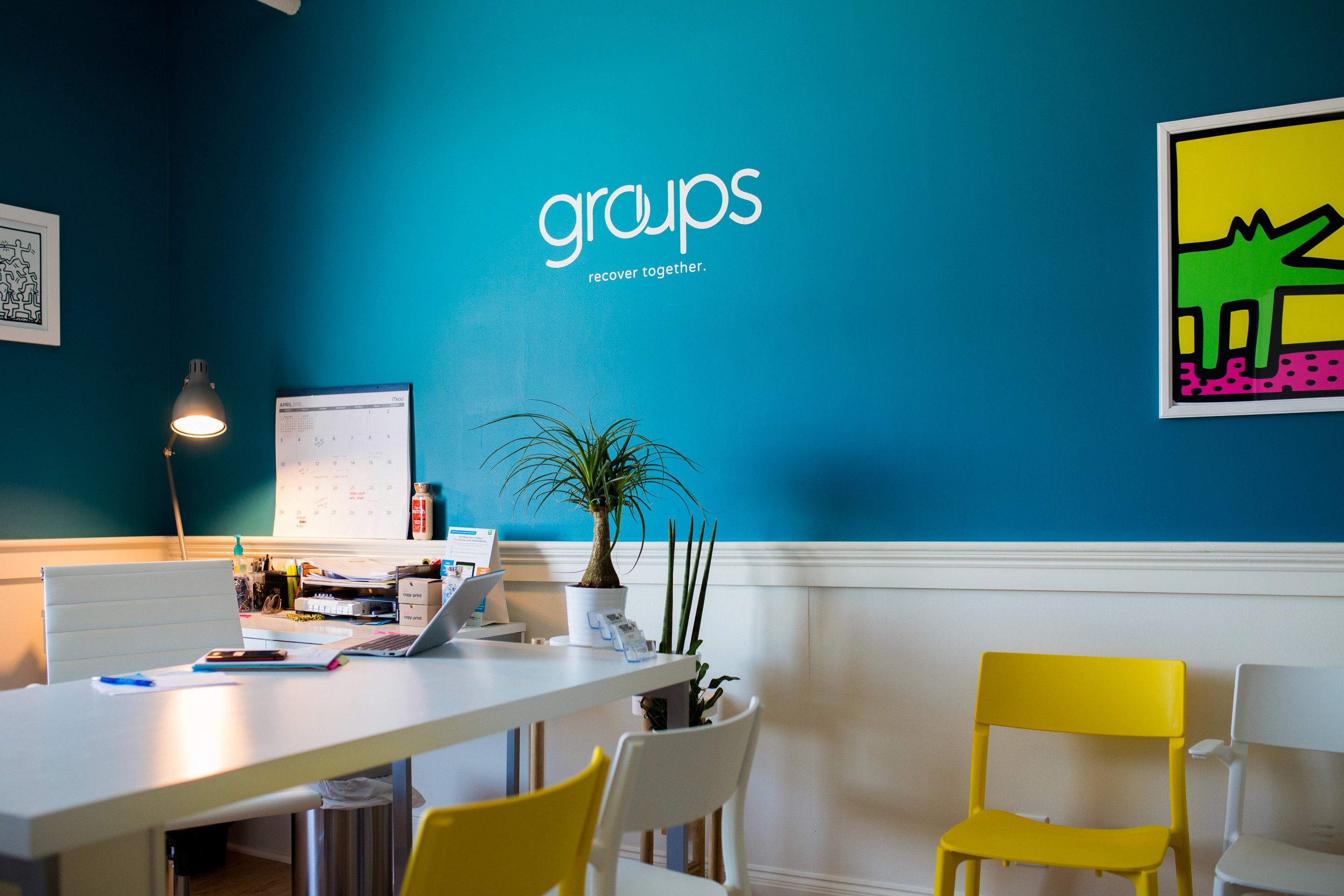
As a rapidly scaling business aiming to solve one of the country's largest problems, the Groups brand needed to be flexible, welcoming and trust-building. They were finishing the design of their first two offices when they came to us for branding. They had no identity other than a name and the paint color used for their offices. They needed patients, their loved ones, and the medical community at large to understand what they offer, how effective it is, and what sets them apart from all the other treatment facilities in the country.
Services
Advertising Design Brand Identity Design Book & Print Design Copyediting Icon Design Imaging
~
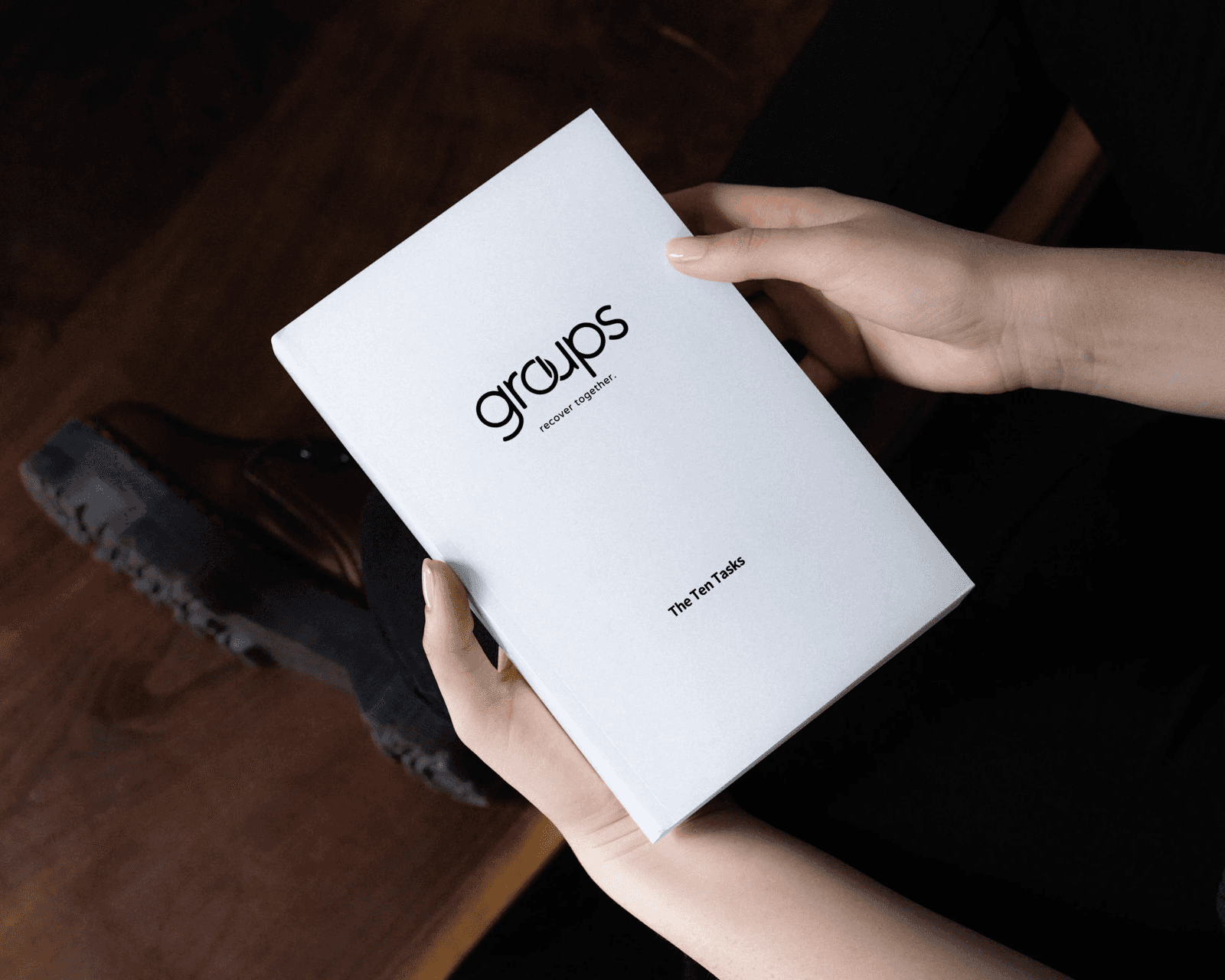
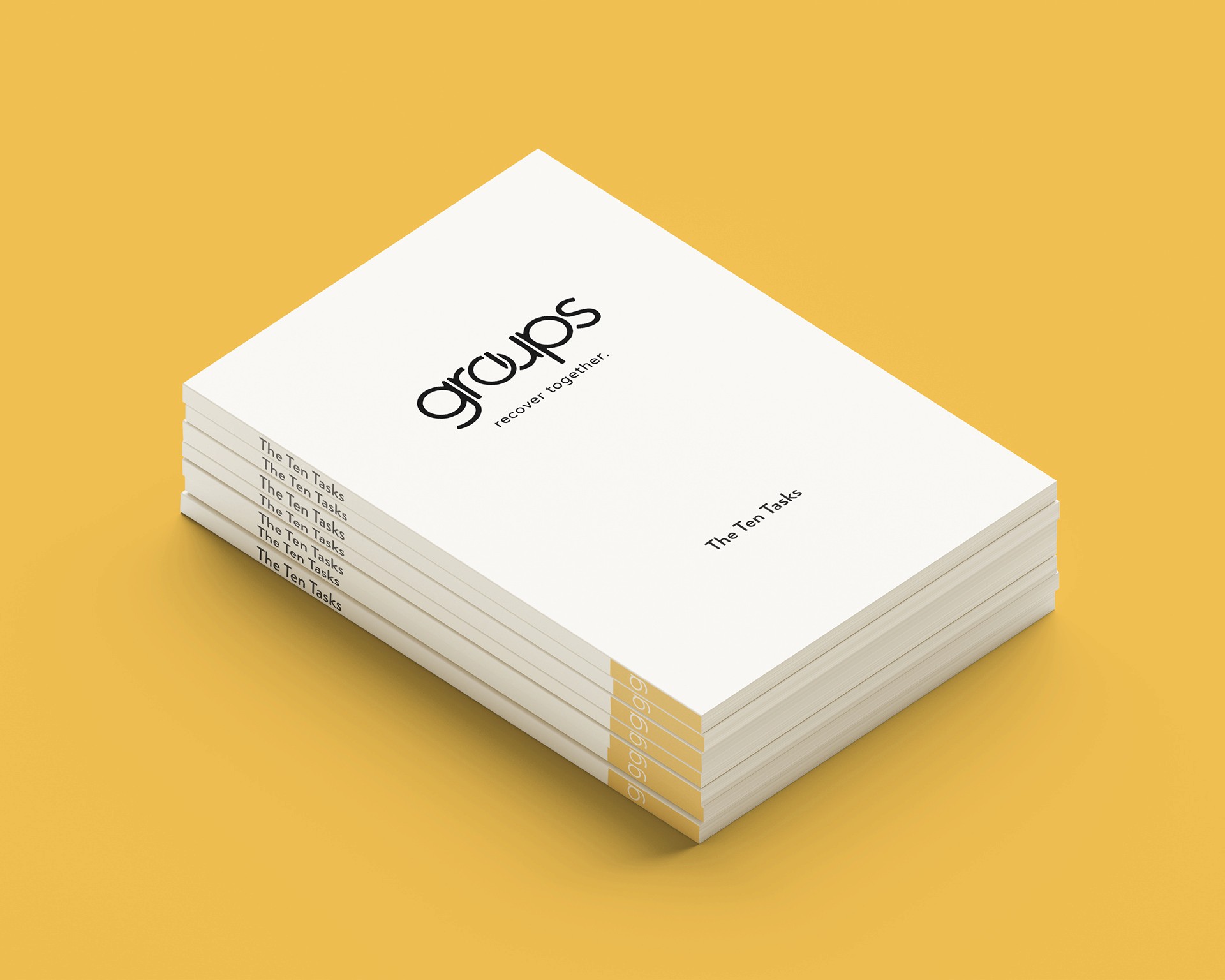
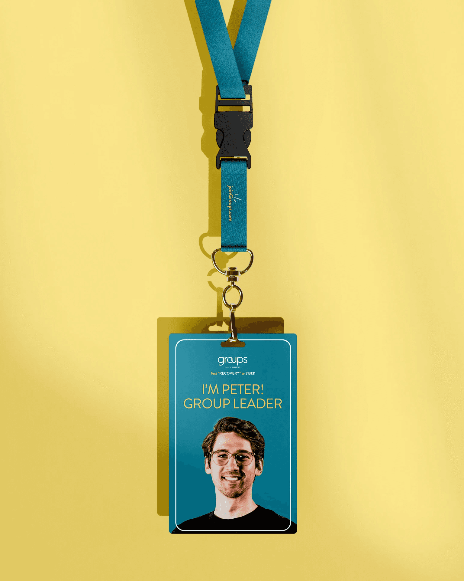
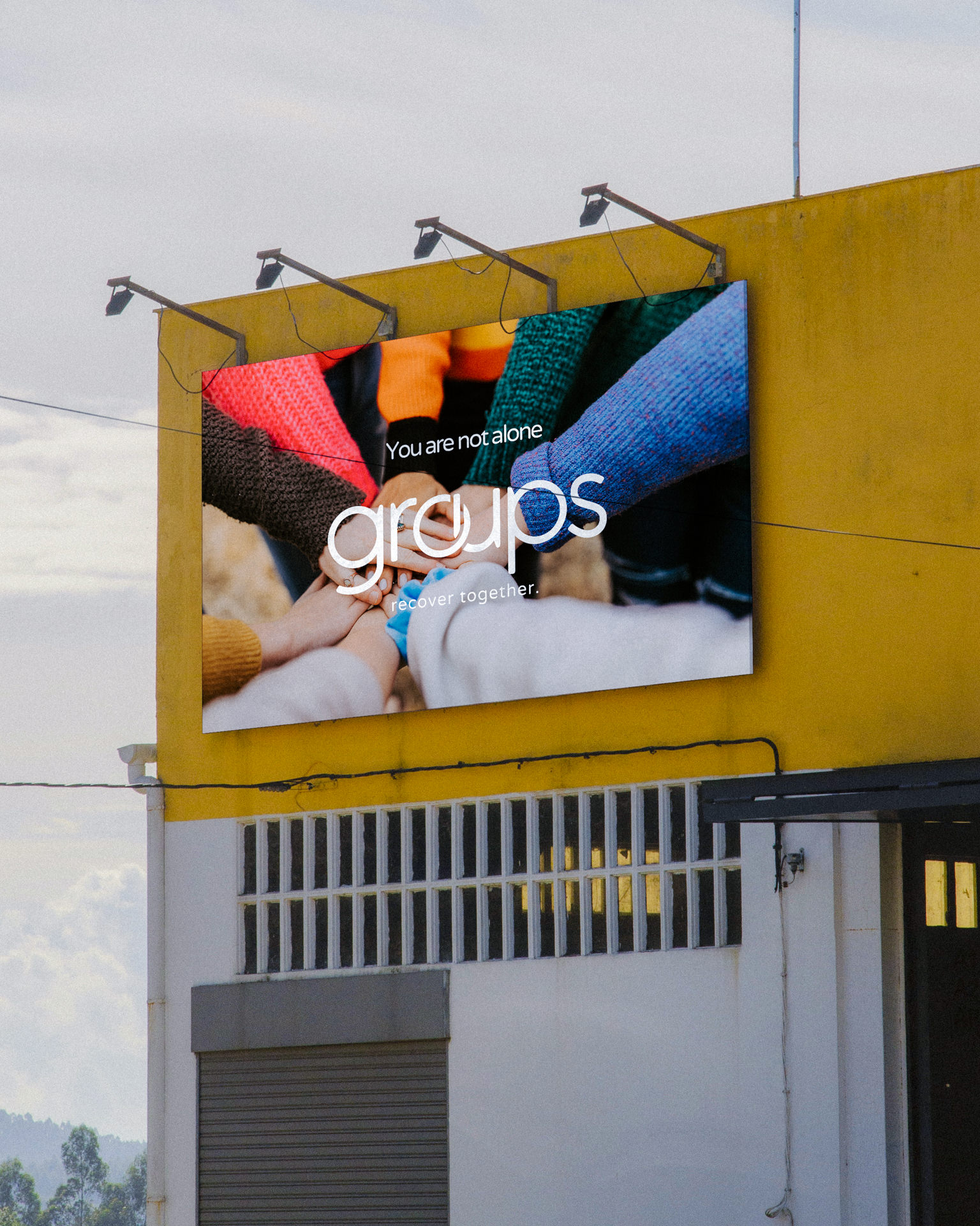
Word Mark
To balance warmth and professionalism, we incorporated the circular format of group therapy into the word mark, additionally interlocking the U and O, symbolizing support and teamwork.
~
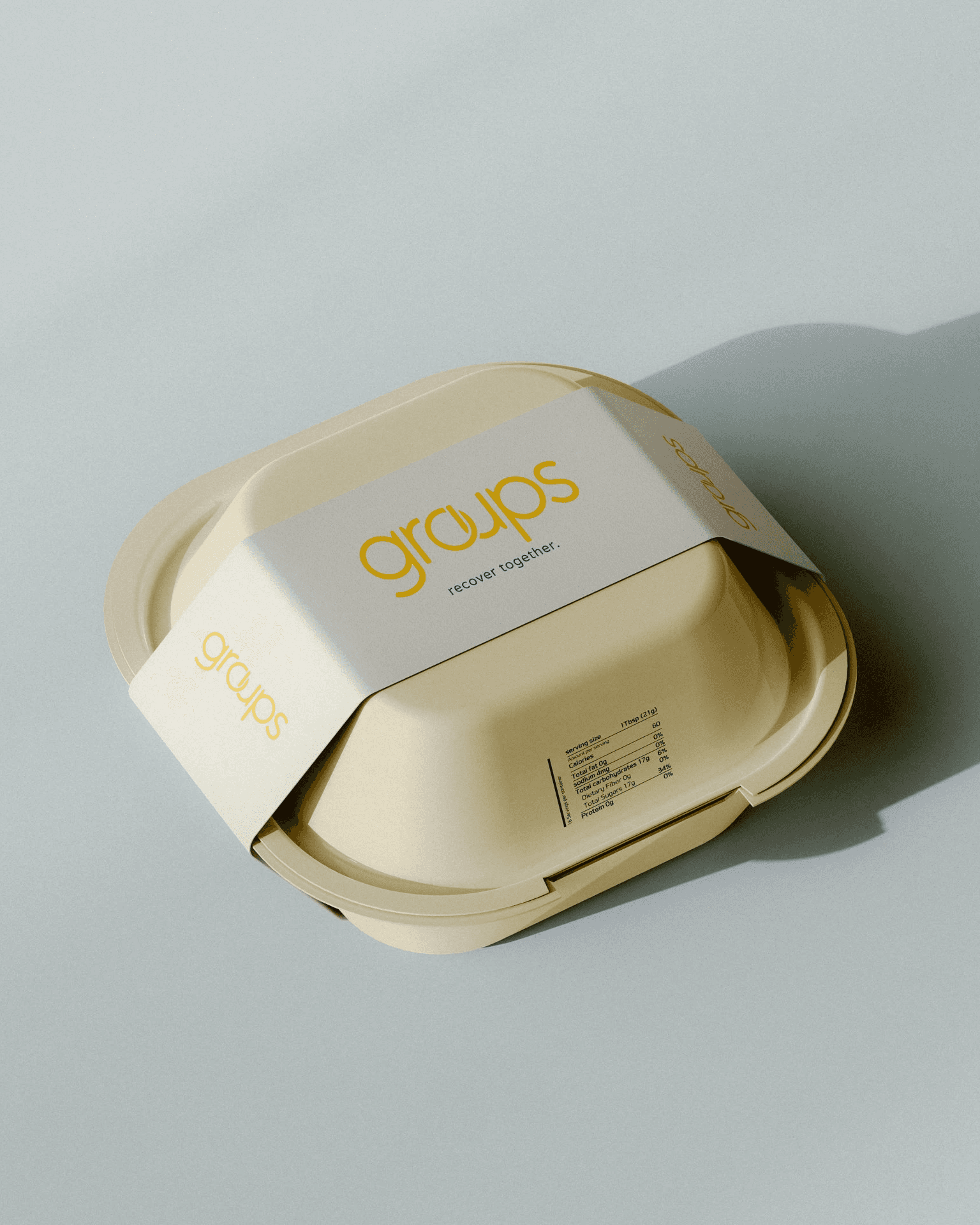
Color
The client came to us having been already painted in their offices in the teal, yellow, white and black, so we worked within that palette on their digital assets to create a cohesive atmosphere for their patients.
~
Typography
The typography had to feel clean and medical, yet safe and welcoming. Rounded sans-serif type met these needs, matching the rounded word mark.
~
Iconography
The art of Keith Haring proved to be an apt compliment; his work is simple yet profound, and speaks to the power of community. We did our best to emulate his style with the five pillars illustrations.