

Dragonwood
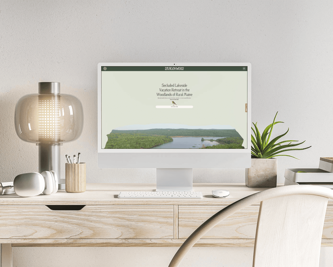
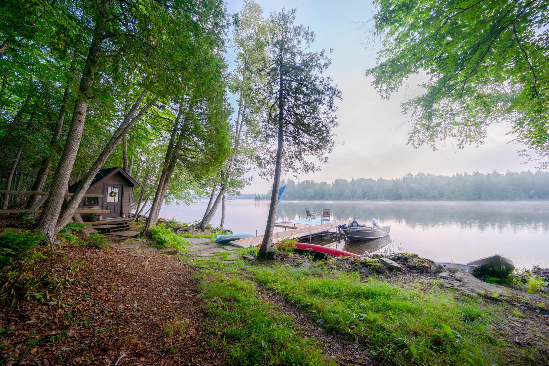
Secluded lakeside vacation retreat in the woodlands of rural Maine.
“Blacksmith did an outstanding job helping us conceive of and develop a compelling brand and web presence for Dragonwood. Their comprehensive and technically expert approach
made what seemed (to us) to be an impossible task… easy. We look forward to working with them in the future as our business continues to grow.”
— Nicky Howell, Co-Founder, Dragonwood
Industry
Hospitality
Description
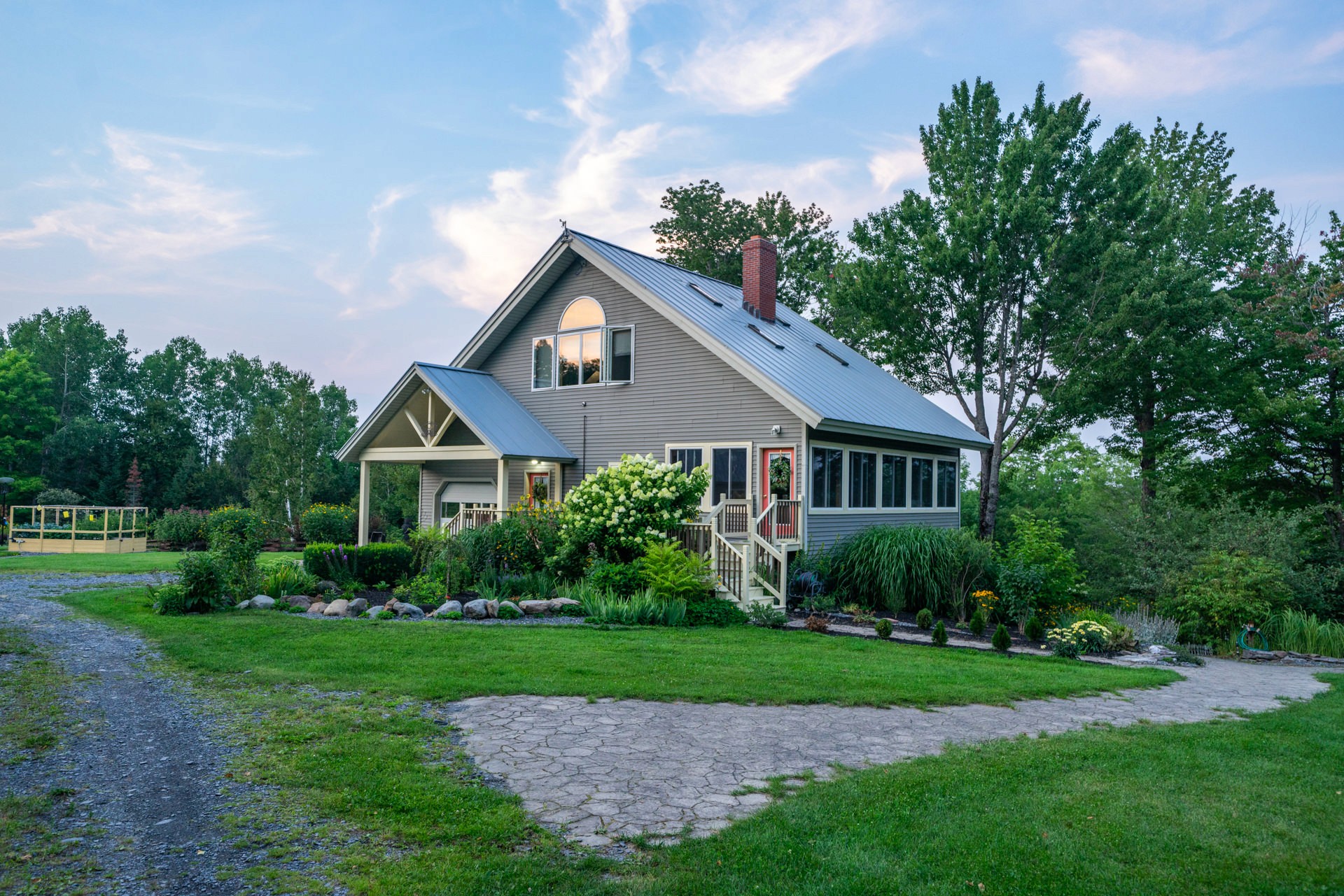
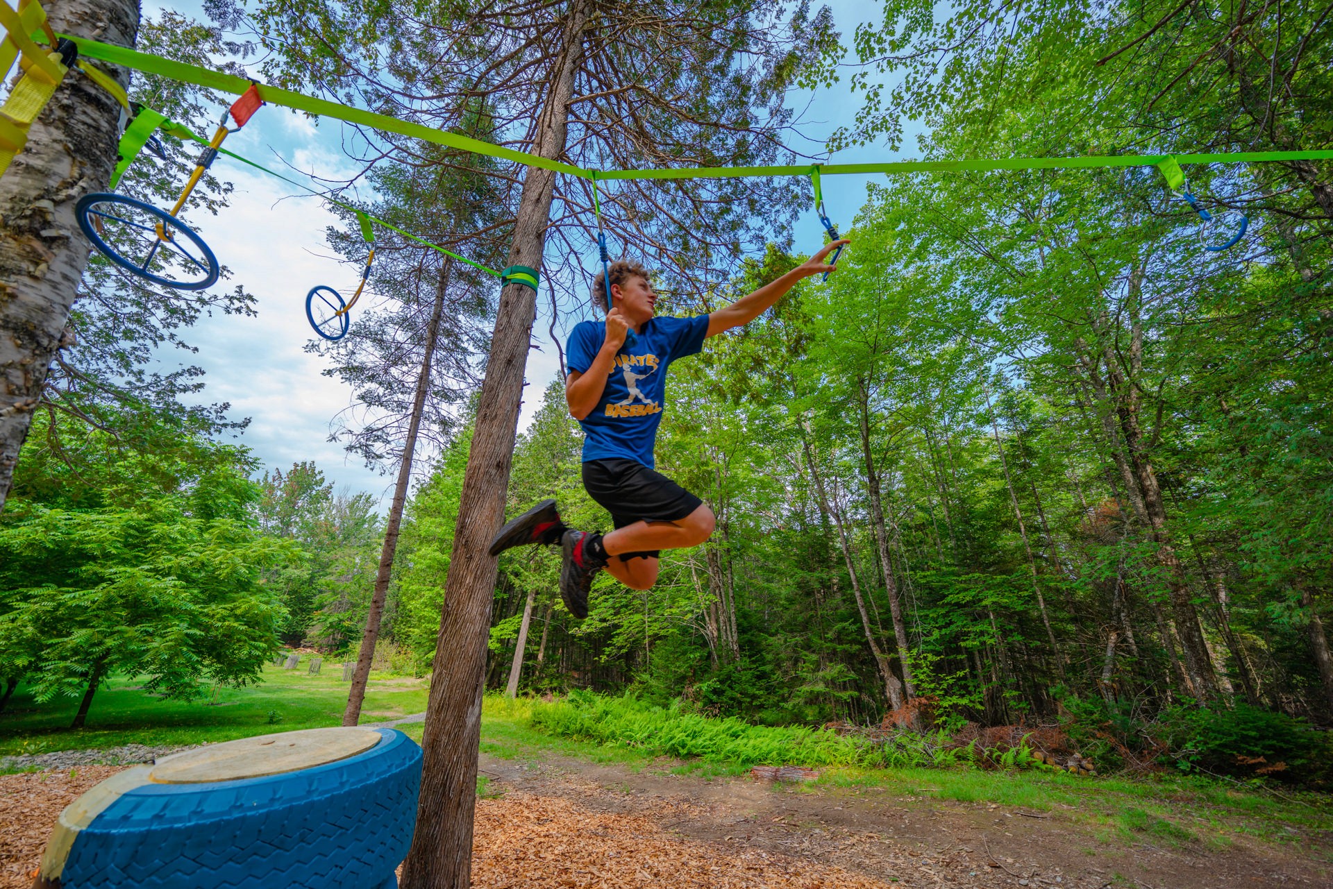
Dragonwood provides off-grid lodging and local excursion booking for families, outdoor enthusiasts, and events. Their extensive regional knowledge, preparedness, and collaboration with the local community allow them to create safe, fun and fulfilling adventures designed to rekindle guests' connection to the natural world.
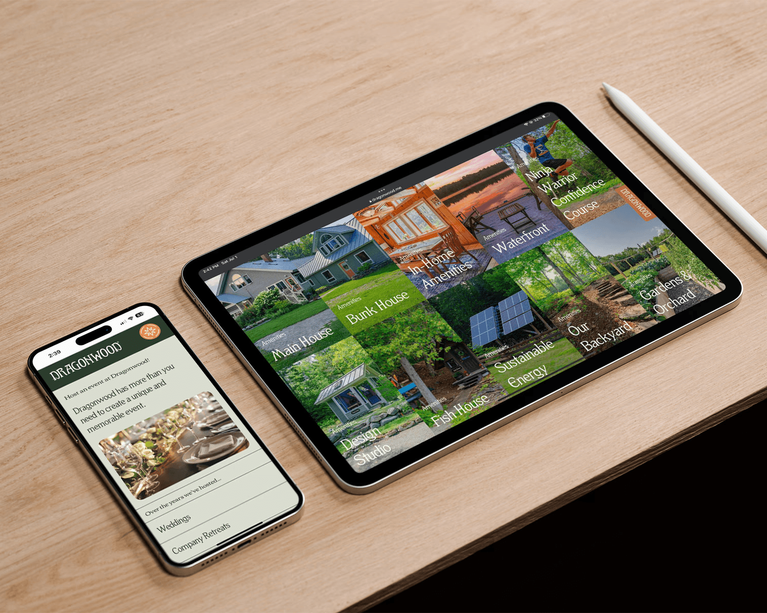
When we began, Dragonwood had no branding other than the name. They needed messaging, photography, video and a website. More than anything, they needed guests to understand what they had to offer. The property is ever-evolving, with a growing capacity for event hosting and new amenities every season.
Our goal was to make Dragonwood as welcoming as it is in real life, with a clear sense of everything that can be done both on the property and in the surrounding region.
Services
Brand Development Brand Strategy Brand Identity Design Creative Direction Photography & Imaging Web Design & Development Drone Video

~
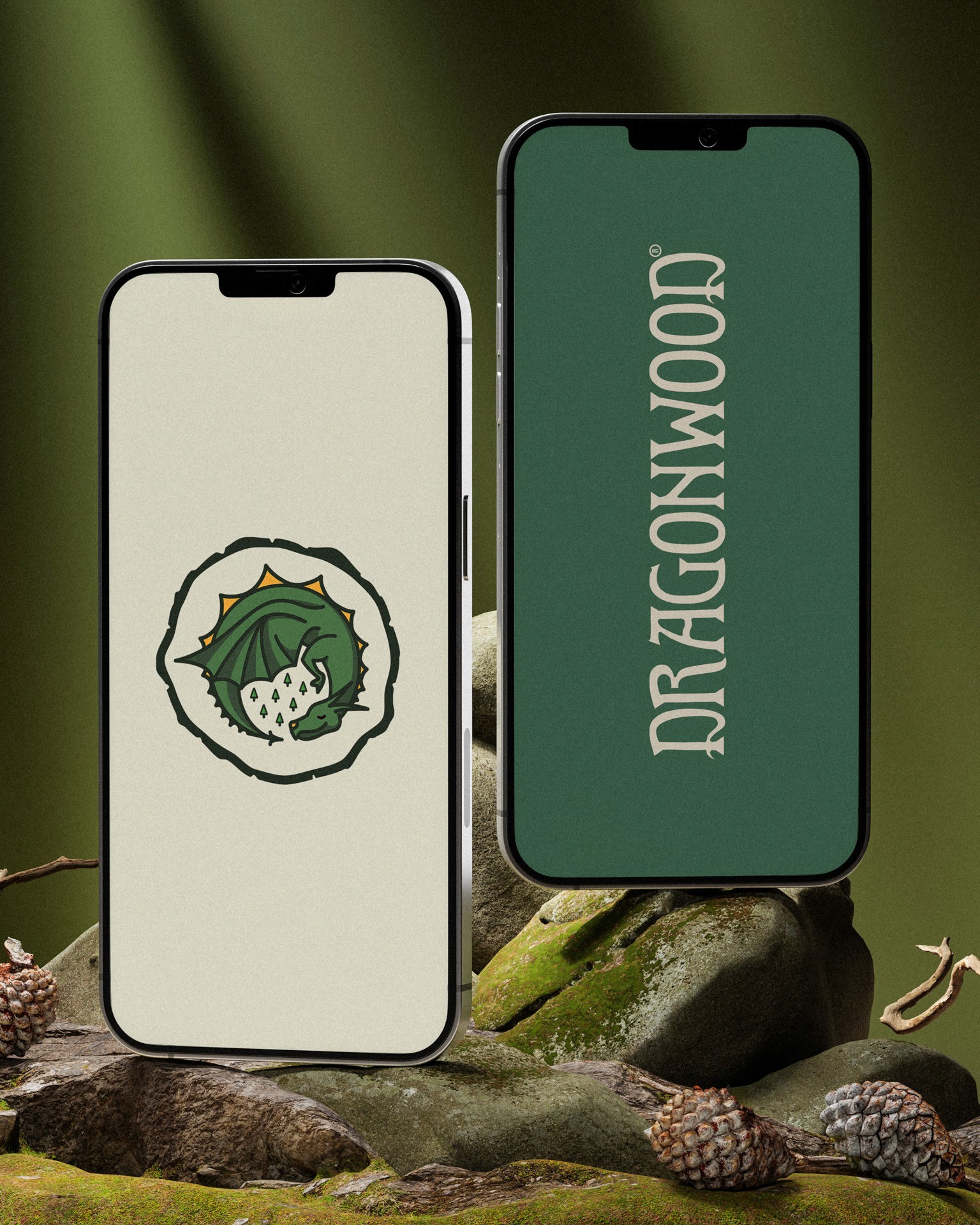
Logo Mark
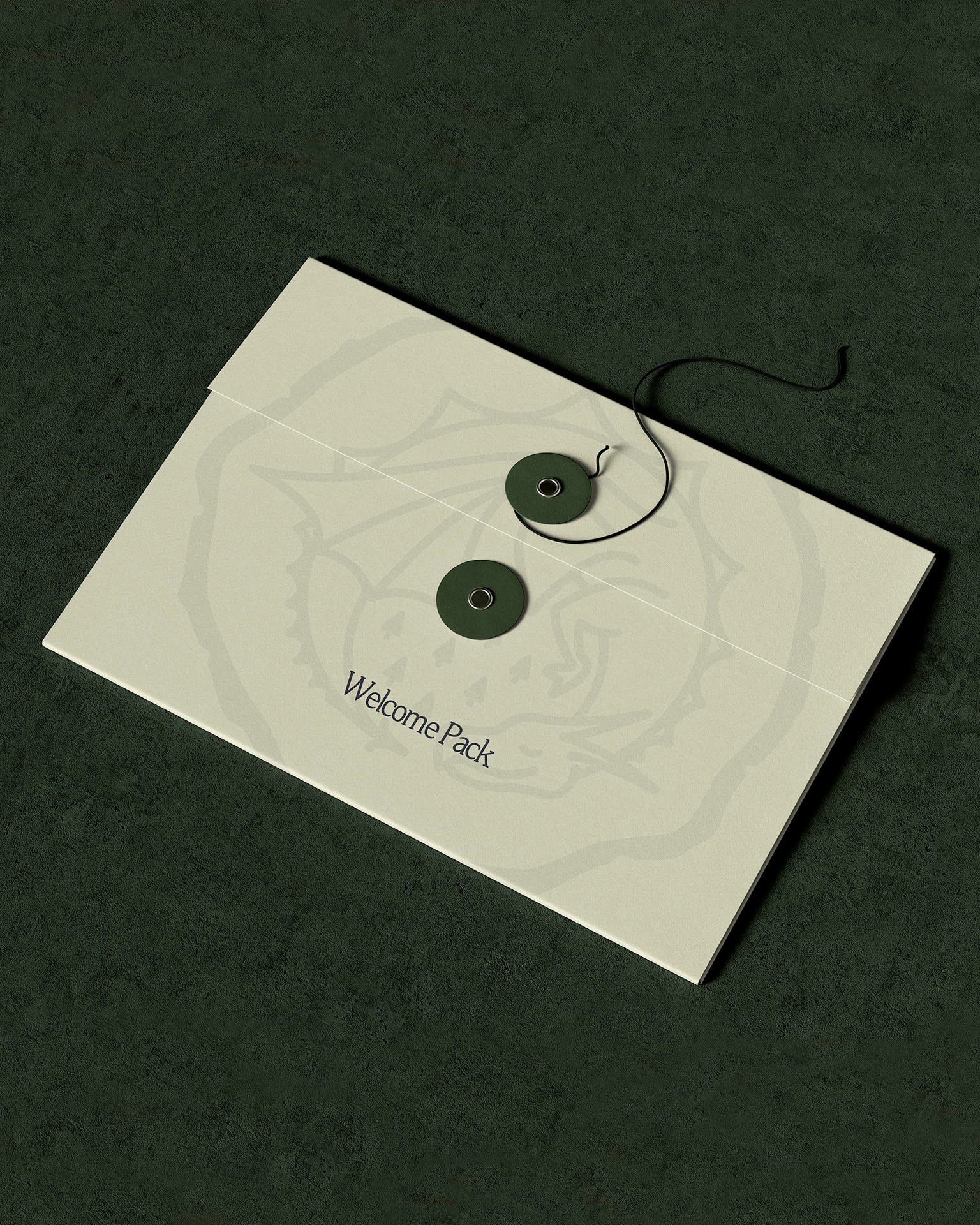
The logo mark was of course inspired by the name Dragonwood. Initially the client wanted a smiling dragon with open arms, but we took a chance on a different idea: a sleeping dragon, protecting its treasure—the forest. A simple smile on the sleeping dragon's face helps create a sense of ease, inviting the viewer to share in its peaceful rest. The sharp points of the sunshine ridge on the dragon's spine are eased by the circular frame shaped like the outer ring of a tree stump.
~
Word Mark
The word mark for Dragonwood utilizes an organic, approachable typography with subtle dragon-like features, such as the tails on the “D” at the beginning and end of the word.
~
Color
The color palette is inspired by the green forest and green scales of the dragon, with warm accent colors meant to evoke the fire within.
~
Typography
Our lead typographer, Alex Elgg, designed a custom typeface titled “Dusty Shelf”. It is meant to deliver the same approachable, organic feel as the other identity components, and offer a one-of-a-kind brand experience for guests.

